
LGCY
Connect

Solar Monitoring & Customer Portal
UX UI Case Study

.png)
The original “Customer App” for LGCY Power was built on a referral-focused platform (GTR – Get The Referral) that served marketing needs more than customer needs. While it technically qualified as a “customer app,” it offered little value for users after they signed a contract.
With low adoption and limited functionality, the app wasn’t meeting its business goals — or customer expectations. Customers rarely installed it, almost never used it for referrals, and couldn’t meaningfully track their solar system.
LGCY Connect was designed to put customers at the center of the experience by:
This dual focus — user empowerment and process efficiency — aimed to shorten installation timelines, reduce frustration, and improve retention.


To better understand the problem, I ran an analysis on the current LGCY Power app. I specifically tried to view it as a new user, using the app for the first time.


.png)
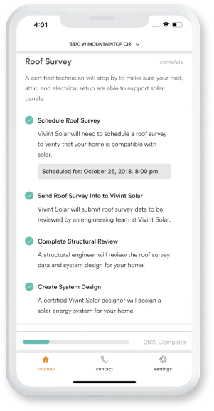
Analyzed competitor apps from Sunrun, Vivint, and others, reviewing their onboarding flows, dashboards, data visualizations, and brand integration. This revealed strengths we could adapt, weaknesses to avoid, and clear gaps in transparency, simplicity, and engagement that shaped LGCY Connect’s design direction.


.png)
.png)
.png)
Reviewed the monitoring platform that LGCY Connect would use, Enphase, to map available production and system status metrics, their update frequency, and relevance. This defined what data we could integrate and ensured the design focused on high-value, actionable information.

.png)


In order to uncover the needs of potential users, some current customers and employees were interviewed about the current LGCY customer app. I paid specific attention to pain points, needs, and suggestions, and noted them below.
From the LGCY Power employee side, it was discovered that there were steps that the customers could do themselves that would progress the install, like uploading utility bills or HOA documents.
If we are able to upload these on the app, this would cut install time down by several weeks.
Not knowing where the customer is in the installation process causes confusion and frustration.
This makes it so user don’t want to refer their friends. While their system was being set up, they want a way to easily see which installation step their job was at.
Once the user’s system has been installed, the customer wants a way to easily view the status of their system.
They would like to see if anything parts of their system aren’t working.
They also would like to see how much their system is producing.
This would add perceived value to their system and decrease cancellations.
With insights from the current app review, market opportunities, user feedback, and data constraints, I began conceptualizing the redesigned LGCY customer app.
I started with the screens the user will see while their solar system is being installed.

I then made the screens that would show after their system is installed and operating.


Once the wireframes were complete and the solutions to user needs were clearer, I analyzed LGCY’s website branding and UI. The goal was to align the app closely with LGCY Power’s visual identity, addressing the lack of brand presence in the existing app.


Using these elements, I updated the wireframes to include these and crafted a mid-fidelity prototype.
Key Screens:
.png)
.png)
.png)
.png)
I conducted user testing of this mid-fidelity prototype with multiple solar customers, as well as several stakeholders at LGCY Power that are familiar with the app’s goals.
Their valuable feedback helped guide a series of improvements to the app, summarized as follows:
.png)
.png)
.png)


Recognizing the value of a referral feature, I prioritized building user trust first before introducing this functionality. To ensure adoption, the referral system needs to clearly communicate its value proposition and provide transparent tracking to reinforce user confidence.
For a seamless referral experience, the design will include:
These elements aim to increase user engagement by making the referral process intuitive, motivating, and trustworthy.


As of August 2025, the pre -and post- installation experiences have been built as a web app and has been implemented into the onboarding process of all new Solar customers.
Please use the links below to view the web app (filled with dummy information)
One major learning: verify stakeholder inputs early. Midway through, I learned the style guide I had used was outdated, requiring several months of revisions in collaboration with marketing.
Despite the challenge, the result is a customer-focused, brand-consistent, and high-value product that strengthens customer trust from contract signing through long-term solar ownership.