

Canvass Team Management
Smarter Manager Tools for Stronger Sales Teams
Smarter Manager Tools for Stronger Sales Teams
Canvass is a map-driven mobile CRM primarily used by sales teams operating door-to-door. However, the existing Team Management feature lacked actionable insights for managers. Performance data was only accessible via monthly reports, impeding real-time decision-making. Managers also struggled to identify rep activity status quickly, and the Area Management section suffered from poor information architecture. Low visual hierarchy and cluttered layouts made it difficult to understand area coverage and allocate resources efficiently.
The redesign aimed to empower managers with granular, real-time data on team and rep performance to drive operational efficiency and increase sales productivity. By introducing focused dashboards and clearer data visualization, the goal was to elevate Canvass’s value proposition as an indispensable CRM tool for sales teams.

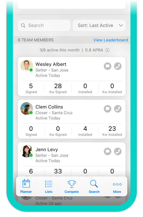
Team Management and Area Management were previously combined into one overloaded page, resulting in cognitive overload despite limited data display. Separating these features allowed for richer, more digestible content.
.png)
.png)
.png)
.png)

For this project, I worked closely with Canvass’ Product Manager. She aided me by not only documenting the problem, she also gathered initial needs for this feature and aided in defining the scope of this project. I was in constant communication with her throughout the design process, especially towards the assessment period.
This is the initial instruction I received from the Project Manager:
"- Display high level team data showing managers how their teams are doing on production for the current month along with their deviations from the pervious month. This will tell the manager if the particular team he/she is viewing is on track to do better than last month.
- Below this dashboard, a list of reps of the team will be shown with a quick view of significant metrics for each rep. From this list Managers can drill down to an individuals rep card.
- Show the following metrics for any given team: Active reps, Signed Deals, kWs, Installed, kWs Installed, Per Rep Average (PRA), and Active PRA.
- Also list total reps on the team. We are unable to know quickly how they got the PRA number because it is not listed on the page.
- Add last month's deviation"
With the needs of the users in mind, and analyzing the limitations of the current app, I created a list of features that would be useful. I began sketching screens with pen and paper, I then transformed these into wireframes using Sketch. This allowed me to better design flows.


In order to see if my proposed solutions would be successful and are worth building, I conducted Usability Test sessions with select Canvass users, as well as several stakeholders. I focused on task flows related to data interpretation and team monitoring. Key test scenarios included:
Following multiple rounds of usability testing and stakeholder feedback, the final designs were refined to maximize clarity, efficiency, and discoverability. I then compiled a clickable prototype to showcase the final product.


After the first 3 months of launch, analytics showed:
The greatest design challenge was access to busy managers for live testing. In-field sales leaders often have packed schedules, so usability sessions had to be highly targeted and concise. This reinforced the need for efficient, low-friction tools that respect users’ time.
On a personal level, this project solidified my ability to structure complex, data-heavy interfaces without visual clutter. Earlier in my career, I sometimes overfilled pages in an effort to be comprehensive; here, I learned how to surface the right information in the right place, making it actionable without overwhelming the user.
Delivering a tool that directly improved managers’ operational efficiency, and seeing measurable adoption gains, made this one of the most satisfying projects in my portfolio.
.jpg)